

You must log in or # to comment.
There’s just something about fonts that are supposed to look hand-written but are too perfectly curved, every letter looking perfectly consistent, etc, that my brain rejects.
Like when you see CGI or computerised physics in a film that’s 90% there, but there’s something about it that you can’t put your finger on that leaves a somewhat jarring “this isn’t right! Something is wrong here!” in my primative monkey brain.
The term you’re looking for is “uncanny valley”
There are several monospace adaptations of Comic Sans which are great for use in terminals or IDEs. I particularly like this one:
https://tosche.net/fonts/comic-code
I have never seen another terminal font that is so easy and fast to grok.
I also bought and use this in a terminal and Emacs. I really do feel like it increases legibility at a much smaller font size.
Let’s bring back those animated gifs (mailbox and under construction) from the 90s. That’ll get everyone riled back up again.
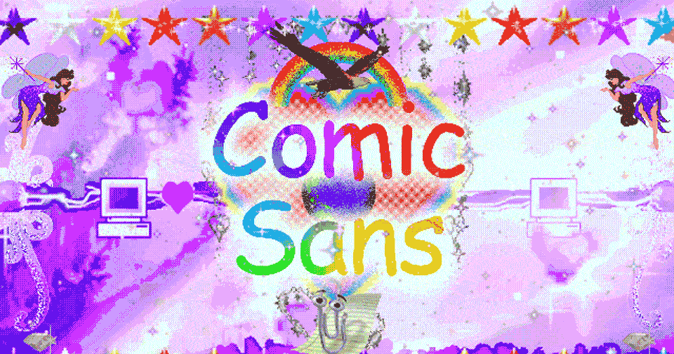
I’ve had this one in my images folder for at least a couple of decades. No idea where I saved it from:

Can we talk about Papyrus
I… actually never hated Comic Sans and never understood why it was so hated. I mean, at least everyone knows about it.
I always thought the Algerian font was ugly as hell (it probably has nothing to do with Algeria)
Is the URL broken for anyone else?
Yeah, looks like 12ft is the issue, even their homepage won’t load for me.
504 Gateway Time-out nginx/1.18.0 (Ubuntu)
Luckily I got the default Atlantic URL to load with my paywall blocker.